
RANA RESTAURANT
Identity
Identity
Pastificio Rana is the most important Italian food brand in the fresh pasta sector and one of the most important food companies in the world for innovation and research.
Over the years, with the aim of diversifying the business and increasing brand awareness, Pastificio Rana has invested, in parallel with the production sector, in the world of catering.
We designed the new restaurants visual concept, from the interior (link) to the brand identity.
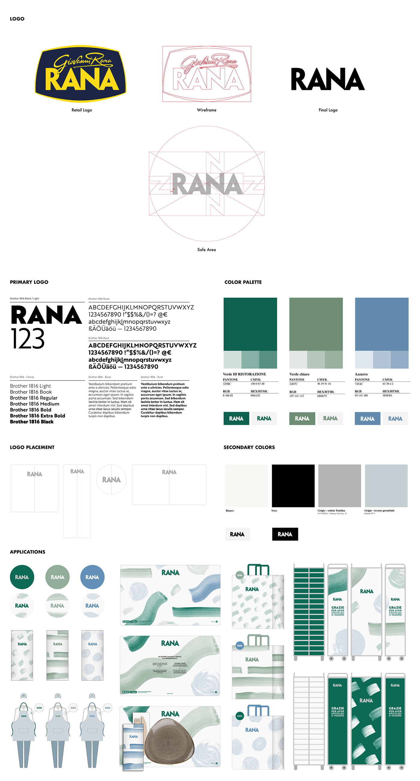
Our goal was to craft a comprehensive identity system that fulfilled both
the need to be visually recognizable and the desire to adapt to the flexible aesthetic of each different restaurant. Our first bold move was to revolutionize the logo by removing every graphic element aside from the name “Rana”. By doing so, we created a more streamlined, flexible but still easily recognizable logo that could fit in any aesthetic and or color palette.
the need to be visually recognizable and the desire to adapt to the flexible aesthetic of each different restaurant. Our first bold move was to revolutionize the logo by removing every graphic element aside from the name “Rana”. By doing so, we created a more streamlined, flexible but still easily recognizable logo that could fit in any aesthetic and or color palette.
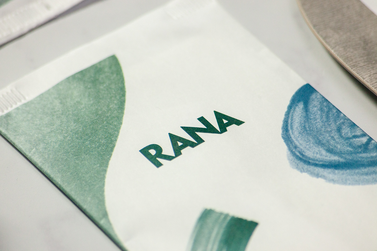
The second major design choice was to opt for an organic, abstract pattern made
of brush strokes and shapes, in order to convey a fresh and modern look without
taking away the customer’s attention from the food.
To fit the interior design style chosen for this specific location,
we sampled three Pantone colors to use for all identity outputs.
From the staff’s uniform to the napkins, every item features the delicate hues
of the restaurant interior.
We went for soft watercolor strokes (painted by us, of course) and arranged them in various patterns and color combinations to better match the light and airy atmosphere.


Client: Pastificio RANA S.p.A.
Project: RANA Restaurant — Visual Identity
Special Thanks To: Antonella Paternò Rana, Pasquale Sorrentino
Project Management: Federico Padovani
Art Direction: Federico Galvani
Illustration & Graphic Design: Anna Rodighiero & Erica Zipoli
Project: RANA Restaurant — Visual Identity
Special Thanks To: Antonella Paternò Rana, Pasquale Sorrentino
Project Management: Federico Padovani
Art Direction: Federico Galvani
Illustration & Graphic Design: Anna Rodighiero & Erica Zipoli


